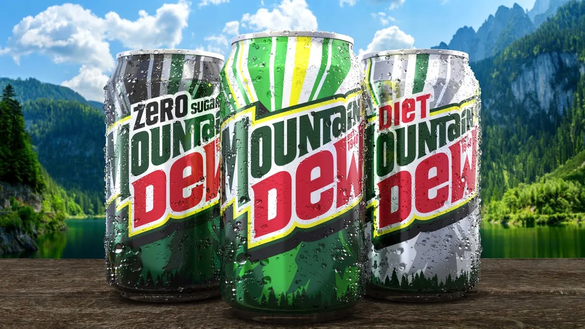
Marketing in the News: Mountain Dew's Rebrand
Mountain Dew is making a rebrand of the image on their cans, and compared to the last design, it's a massive change. Chris Kelley, senior reporter for popular website "Marketing Dive" recently wrote an article about this topic. In this article he highlighted a few main things. He talked about the new image that Pepsi Co is putting on Mountain Dew cans starting next summer. Along with this he went over the design and pointed out some important details. In the article, he used a couple quotes as well from people at Pepsi Co to describe the reason for the change in design. Lastly, he mentioned that this was part of a campaign also involving the creation of a mascot "Mountain Dude" to "reinvigorate Mountain Dew's iconic tagline (Do the Dew)" (Kelly, para 4)
This change in appearance is a bigger change for a couple reasons: its changing the words on the can from Mtn Dew to the full Mountain Dew and second, it's busying up the simplistic design they currently have and filling much more of the available space with images of the outdoors. The different images will vary between the types of Mountain Dew that you buy. Mountain Dew cans have never been cluttered or filled as far as the design on the can goes, but this new rebrand changes that filling up the space with trees, rays of light, and other outdoor features. They're attempting to reclaim the value proposition of Mountain Dew, celebrating the great outdoors and great times with friends. Now personally I remember drinking this most when I was pulling all nighters playing video games with friends, but the same still holds true, it is about being with others.
Now this type of rebrand is especially relevant today, when consumers are looking more at the message behind something rather than the product itself. As much as you can on a can of soda, Mountain Dew is trying to tell customers that they care about the outdoors and encourage you to enjoy the Earth we were given. This strikes home with a lot of people, especially those who do a lot of hikes or backpacking, which are becoming increasingly popular in today's society. Not only is it appealing to customers in this way, going back to an older looking logo also inspires nostalgia in some of their customers who have been drinking their soda for a long time. A remade logo like this is something we're seeing all across the marketing world recently, especially in the consumable good industry. We saw Burger King take a step back and go with an older style of logo, and McDonalds did the same thing back in 2018. The past is a sweet thing and it makes you not only remember what the product was like back then (maybe it was better) but it also makes you reminisce about the memories you made back when the logo looked older. It might awaken some new memories, or bring some new joy, and for those that aren't reminiscing, it presents itself in a more attention grabbing way so it is easier to see and notice on the shelf.
Now, all things considered I don't disagree with the way that they did this. I personally would make a few tweaks. While going back to the outdoors root could be a good thing, I think most people would agree that despite the name "Mountain Dew", nobody thinks of the outdoors when it comes to this drink. They think of gamers, and teenagers who want a sugary and caffeine filled drink. Not only this, but I've seen huge success in companies that push towards a more simplistic logo, especially when that logo also looks like the previous ones. Instead, they've crowded their can with graphics and it makes me want to buy less of their product rather than more. That may not be an opinion consistent with the majority of consumers but many people I've talked to share the sentiment that brand logos are getting worse as they become too cluttered, or in some rare cases, (Firefox) oversimplified. It's not a bad marketing strategy and it may very well work, but as with all marketing, it could always work better.
That's all I've got folks, may the Lord bless and keep you all!
Marketing Dive Article: https://www.marketingdive.com/news/mountain-dew-new-logo-visual-refresh/728669/


Comments
Post a Comment